i'm not really sure where to start with web design. like a lot of people my age i feel like I grew up on the internet trawling through weird and then-mysterious websites: big (for the early 00's) weird-humor websites like ytmnd, mysterious or eerie artistic experiential websites with no understandable purpose, interactive puzzle sites that required my friends and i to delve into the HTML and look up code-deciphering tactics, and my personal favorite "towel.com" which used to just be the word "towel" on a black background, with a guestbook. now it's a place that actually sells towels, apparently, and whenever anything weird surfaces on the internet CNN runs a story on it. i miss the weird stuff, but it's still out there -- it's just harder to find under the layers of professional companies and businesses that have knitted together the web, making it more digestible and less joyfully cryptic.
anyway! since for this project i'm intent on making a portfolio website, which i've been hoping to do for a long time, i won't be able to focus on making weird experimental content. but i am interested in learning how a site can be both clean and simple as well as non-boxy, and molded to an artist's individual hand. designer marisa passos' website (here) is an example of a website that i like in some ways and dislike in a lot of other ways -- it's entrancing, with a beautiful auto-playing video of swirling ink, but it takes time to load and it completely distracts from the actual portfolio, which is boxy and way more boring than the ink in the background!
lucia soto's website (here) is closer to the kind of portfolio site i enjoy -- it's very fun and cute and even though it's interactive it loads very quickly. it shows off her personal artistic style in the design itself. that said, its navigation gets pretty annoying pretty quickly -- you'll see what i mean if you try to go back and forth between her bio work and contact. adorable and appealing, but time consuming, and her "work" section requires you to scroll through image by image, with no indication of the number of items in her gallery. marc dahmen's site is even more frustrating, in my opinion -- if a website requires a keyboard tutorial to tell you how to navigate, it's gone too far, no matter how pretty or fast it is.
i really like the simplicity of camellie.com (especially that animated elephant, i love non-distracting bits of animation) though it's not perfect! meg hunt's site is lovely -- simple and immediately appealing with big thumbnails.
so -- i'm inspired by a lot of these portfolio sites, especially the ones that are simple, weird, and colorful while not being overly-ambitious in design. right now the portfolio site i'm making is very subdued (and i want it that way), but i hope that in time i can try to create something this appealing.
Thursday, April 18, 2013
Tuesday, April 2, 2013
Vito Acconci reading
paragraph 13
"the electronic age obliterates space and overlaps places"
this paragraph stood out to me as being especially pertinent to modern digital media and online interactions. "the electronic age establishes the primacy of time," says acconci, and the truth of this statement has grown exaggeratedly: now we demand immediacy in every part of our lives, in finding out information and answering questions we don't know, in talking to people, in seeing images. time has gone from a concept to a physical object (clock) to a number, and similarly everything in our lives is codified, packaged and sold and readily available. people are numbers -- the number of pageviews on a site, the number of friends you have on facebook, the number of comments you get on a blog post or piece of art, the number of upvotes or likes your written opinions earn. the physical world is indeed "a slowing-down process", one which can serve as a welcome change of pace, although even public spaces are now infiltrated by the technology on our smartphones and laptops. despite his eccentricity i like this reading.
Thursday, March 21, 2013
Wednesday, March 6, 2013
vector artist: rafael aquilar
rafael aquilar is a vector artist based in mexico city, who has an incredibly detailed and rich artistic style. i love his nuanced use of colors -- teals, yellows, and reds especially, and the organic, human touch to all of his lines, which gets lost in many vector illustrations.
he cites influence by gustave dore, a 19th century wood/steel engraver, in realizing the potential of adobe illustrator for his drawings.
he goes over some of his techniques in this interview.
also here's a process gif from his personal blog:
he cites influence by gustave dore, a 19th century wood/steel engraver, in realizing the potential of adobe illustrator for his drawings.
also here's a process gif from his personal blog:
logo remix
Tuesday, February 26, 2013
Thursday, February 21, 2013
music interpretation -- illustrator
i went with a pretty simple drawing ... the song made me think of water and sloppy puddles but also silliness, which made me think of a pink/yellow color scheme.
Tuesday, February 19, 2013
artist post 3 - tony robbin
An artist who stuck out to me from the Paul Hertz reading was Tony Robbin, an artist and geometry aficionado. When I first read about his exploration of different dimensions and perspectives and means of conveying them on a 2 dimensional canvas, I thought of Cezanne and his paintings composed of multiple perspectives knitted together, or the Futurist artists who blended abstract imagery to create a sense of movement and time progression.

2006-7 by Tony Robbin. Acrylic on canvas
Like paintings from those movements, Robbin's art stands out not just for its engaging color palette, but its genuine dimensionality. Even without an understanding of the method or mathematics underlying the above painting, I can appreciate the shapes and objects that show up, from up close or at a distance, as defined by color or by line. Wikipedia places Hertz under an art movement called "pattern and decoration", which both embraced floral geometry and rejected the flatness of minimalism.
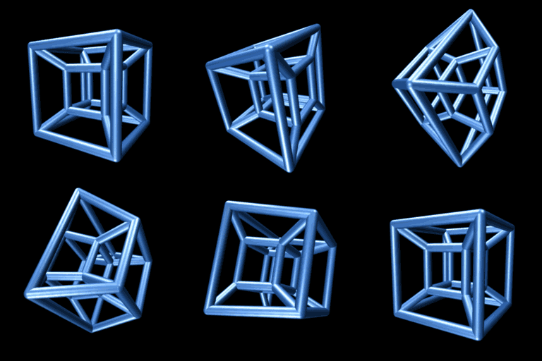
What interests me most about Robbin, however, is the contribution he's made to visualization of the 4th dimension. He recalls his interest in digital art as stemming from an encounter with CGI tesseracts in 1979.

One popular visualization of a tesseract, a four-dimensional shape related to the 3-dimensional cube, represented as a 3D CGI model. Created by Jason Hise in Maya.
Robbin believes not only in the importance of visualization for scientific thought, but in the importance of aesthetic, of beauty and elegance: "Art based on geometry is expected to be dry with only primary colors - who wrote those rules?"

Robbin's contributions to the world of geometric computer imaging and 4D-to-3D projection have been greatly important scientifically, but his paintings stem as much from a love of color and form as from a love of the mathematics underlying them.
Here's Robbin discussing his interests in a vid from the 80's:
2006-7 by Tony Robbin. Acrylic on canvas
Like paintings from those movements, Robbin's art stands out not just for its engaging color palette, but its genuine dimensionality. Even without an understanding of the method or mathematics underlying the above painting, I can appreciate the shapes and objects that show up, from up close or at a distance, as defined by color or by line. Wikipedia places Hertz under an art movement called "pattern and decoration", which both embraced floral geometry and rejected the flatness of minimalism.
What interests me most about Robbin, however, is the contribution he's made to visualization of the 4th dimension. He recalls his interest in digital art as stemming from an encounter with CGI tesseracts in 1979.

One popular visualization of a tesseract, a four-dimensional shape related to the 3-dimensional cube, represented as a 3D CGI model. Created by Jason Hise in Maya.
Robbin believes not only in the importance of visualization for scientific thought, but in the importance of aesthetic, of beauty and elegance: "Art based on geometry is expected to be dry with only primary colors - who wrote those rules?"

Robbin's contributions to the world of geometric computer imaging and 4D-to-3D projection have been greatly important scientifically, but his paintings stem as much from a love of color and form as from a love of the mathematics underlying them.
Here's Robbin discussing his interests in a vid from the 80's:
Thursday, February 14, 2013
Monday, February 4, 2013
artist post 2
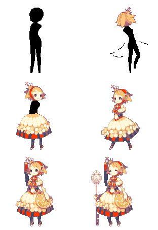
My favorite pixel animator since I first found them on dA many years back is Syosa, a 23 year old Japanese artist.
I found an interview with Syosa here, in which she discusses her favorite color palettes and her interest in the simplicity of pixel art (she compares it to haiku) but also her belief in its potential as an art form. Syosa's art is always recognizable for its beautiful color palettes and fluid, organic movement. She creates her art in the program GraphicsGale. Syosa recently graduated from grad school and has a quiet job at a printing company. She's created some small games, but has not yet forayed into the bigger gaming market, which is a shame.
Some more of her work -- also, here's a small picture book she created, which showcases just how painterly her art is, despite being pixellated.
A gif showing her step by step process:
An alpaca drawn at different resolutions, in pixel art:
Screenshot from her game "Gravedigger"
A cross stitched image, using the same methods as her pixel art:
Thursday, January 31, 2013
Tuesday, January 29, 2013
24 hour technology log!
monday january 28 2013
8:40 - woken up by alarm on phone
9:00 - woken up again by alarm on phone
9:02 - get refridgerated arizona can out of fridge
check email and tumblr on phone
9:20 - arrive at ichthyology class; view slides and images on projector that displays laptop running powerpoint
10:45 - return to PG, open door with ID card
10:46 - buy some chips from the vending machine
10:50 - plug in laptop and ethernet cord, listen to streaming music, save and organize art files, talk to friends and strangers on tumblr and gmail
10:55 - text roommate
11:30 - shower. note to self i need to buy more shampoo
11:55 - consider doing laundry and decide against it
12:00 - check messages and news sites
12:30 - read pdfs for class
12:40 - take some serious advil because this flu is not going away
12:50 - turn off lights for headache and play braid
13:40 - stop playing braid because it's hard and i dont like how the main character looks (bad haircut)
14:00 - reply to a text and recharge my phone
14:20 - feeling hungry and tired but can't sleep. mope
14:30 - watch new adventure time eps and some NGE
16:15 - long convo with friend; try to vidchat with her but her new computer can't run the software
17:35 - buy wrap from upper deck with meal plans on card
18:40 - go to library to do work on laptop/tablet
use wifi to check blogs/email and watch some youtube
do digital art collage with photoshop/tablet
20:20 - finish editing job with word and email it in
22:00 - talk to friends on gmail, do some sketches in sai
23:15 - watch part of terrible spanish dubbed cgi garfield movie on youtube with friend
23:50 - walk to monty to finish art poster project
0:00 - fuss with temperature controls because it is freeezing (it doesnt work)
0:10 - plug in portable heater from drawing class to continue working
1:20 - head back to dorm
2:00 - set alarm for 9:30
2:10 - try to fall asleep amidst the glow of my roommates clock and about 5 other blinking devices
??? - probably dreamed about like robots or something
Monday, January 28, 2013
scan collage
some kind of lightning storm thing?
used scans from emily j, emily r, emlyn, kathleen, rose, sachiya, and sarah.
Thursday, January 24, 2013
Tuesday, January 22, 2013
Wednesday, January 16, 2013
christiane paul reading response
INTRODUCTION:
Christiane Paul discusses both the shifting terms used to describe digital or computer-based art and the implications of it as a new "type" of art -- after all, digital painting and even 3D modeling rely on age old techniques and standards. She defines digital art as "art that employs [digital technologies] as its very own medium, being produced, stored, and presented exclusively in the digital format and making use of its interactive or participatory features." This definition immediately makes me question whether digitally created art is still "digital" if printed. She introduces the term "bitmapping", which I've never heard defined before, and her claim that digital art was influenced by Dadaism and similar movements is interesting, especially in regards to the ideas of "randomness" and "control". The examples she pulls are mechanical installations and kinetic sculptures -- both of which require a working, controlled technical framework to support conceptual randomness, although I wouldn't say that "control" is a prevailing theme in the Dadaist movement at all, but it did expand the grounds of what can be considered art, and what "readymade" material is acceptable -- if paints, brushes, and canvases are factory made as well as Duchamp's Fountain, then digital art must be accepted similarly despite its reliance on technologies produced elsewhere.
Nam June Paik's "Random Access" was especially intriguing to me, as was the hypertext concept/system "xanadu" which has a remarkably humble (yet cryptic) site.
It seems funny today that, in 1977, recordings of what were essentially prototypes of mundane webcam interactions were wild enough to be considered art -- though as Duchamp proved, what we regard as cheap or mundane can always be retooled through an artistic lens to great (or greatly critical) effect.
What amuses me about Paul's thinking on the difficulties of exhibiting digital art in real-world public spaces is that, today, physical paintings and drawings have also be converted into digital art, and the vast majority of people will only experience famous paintings in that medium. She acknowledges this inevitable "integration" of internet technology and daily life, as well as its upheaval of "scarcity" as a concept (which, of course, is equally as fraught a topic in film and gaming industries).
CHAPTER 1: Digital Technologies as a Tool
I have a hard time envisioning what a "digital art installation" entails, as digital art -- in my mind -- represents 2D computer paintings or animations, while video games occupy another area of computer generated art. Thus I can only envision a computer program as fitting Paul's concept of "digital art", one which runs with little to no outside interaction. She remarks on the confusion of the concept herself, mentioning art installations that do (or don't) use digital technologies, but seem not to (or to). I can understand "digital" as a new era of art, but not as a category, as more and more digital technologies become more fundamental and integrated into our creative processes. We wouldn't call all work that relies on camera work "camera art", nor all work that uses industrial spray foam "industrial spray foam art".
I had no idea that facial overlaying was even possible in 1982, so Nancy Burson's "Beauty Composite" and Lillian Schwartz' "Mona/Leo" are exciting to learn about. I'm also interested in Annu Palakunnathu Matthew's art, which parodies (Indian) movie posters (I'm taking poster design this semester) with a focus on gender and politics.
I tried to find Craig Kalpakjian's "Corridor" online, and failed -- his name brings up only ONE result on youtube, which is ridiculous considering his digital and video artwork (which, from the photo, looks impressive for its time). Some of his stuff is currently on exhibit at the Met, which is only more upsetting to learn, because someone should be recording it so I can see it.
Now I found this Peter Campus movie and it's totally fantastic. I got pretty distracted from the reading.
Anyway, William Latham's fractal art, which Paul describes as based on genetic programming, brings to mind Conway's Game of Life, and the seeming limitlessness of a digital plane in which complex images can grow and reproduce endlessly according to simple code. I love Casey Williams' decision to use a cheap inkjet printer on a professional canvas and Joseph Nechvatal's deliberate degradation of his own art via corruption and remote execution.
Subscribe to:
Comments (Atom)


